Key takeaways on Cloud Dancer and beauty & wellness design
- Pantone’s 2026 Colour of the Year is Cloud Dancer, a soft white symbolising clarity and calm.
- The choice has sparked debate, with critics calling it elitist and brands questioning its creative potential.
- In beauty, Cloud Dancer offers versatility: minimalist packaging, bold contrasts, and texture-driven innovation.
- Wellness spaces may adopt Cloud Dancer for clean, serene aesthetics – with a focus on warmth to avoid sterility.
- Experts question whether Colour of the Year drives lasting trends or short-term hype.
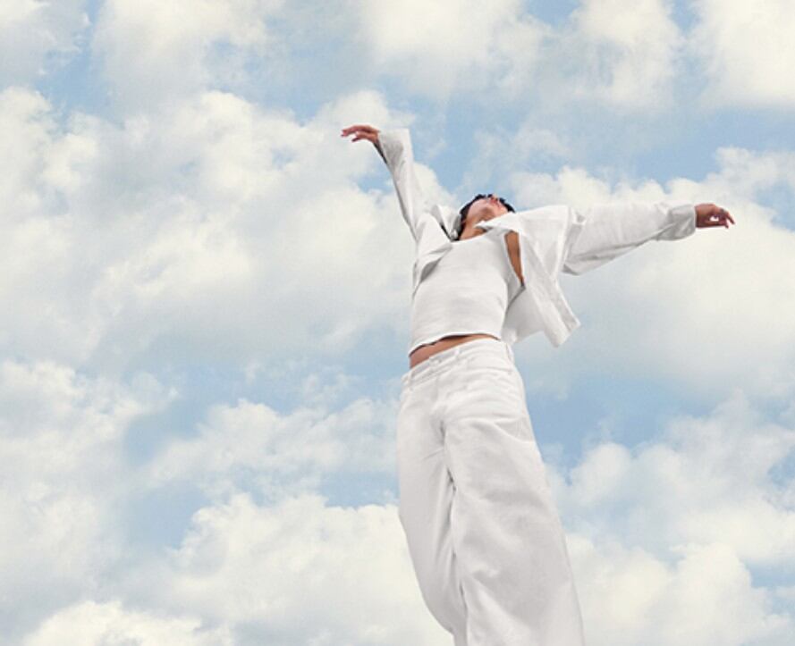
Pantone recently revealed its 2026 Colour of the Year, Cloud Dancer, “a soft, airy white” chosen to convey clarity, calm and simplicity in an increasingly complex world.
“At this time of transformation, when we are reimagining our future and our place in the world, PANTONE 11-4201 Cloud Dancer is a discreet white hue offering a promise of clarity,” explained Leatrice Eiseman, Executive Director of the Pantone Color Institute. “The cacophony that surrounds us has become overwhelming, making it harder to hear the voices of our inner selves. A conscious statement of simplification, Cloud Dancer enhances our focus, providing release from the distraction of external influences.”
Pantone’s Cloud Dancer: a colour of calm or controversy?
This is the first time white has been chosen as Colour of the Year since the annual initiative launched in 1999.
Big brands such as Play-Doh, Post-it, Motorola, Joybird and Mandarin Oriental have already announced collaborations with the colour. However, this year’s announcement was met with backlash – with some critics taking to social media to declare that Pantone is “whitewashing” and “Pantonedeaf.” Others have suggested that white signals wealth and elitism.
Last year’s colour, Mocha Mousse, also attracted its fair share of criticism, but this year, the global outcry towards Cloud Dancer has been next level.
Eiseman was quick to point out that the Pantone Color Institute selected this colour for its creative resonance, not as a political statement. “Pantone does not assign political narratives to colour; to select or avoid a hue on that basis would give such narratives a significance they do not hold in this process,” she said.
Instead, she assured that Cloud Dancer is “a colour about relaxation, reflection, and creativity.”
“The selection process is rooted in an understanding of humanity, drawing on close observation and global trend analysis to recognise what is emerging across the design landscape,” she explained. “It considers the moods a colour can evoke and the experiences it can shape in design.”
How white already influences beauty design and wellness spaces
In terms of beauty and fashion, white has long been the colour of choice for the celebrity quiet luxury aesthetic, favoured by understated stars such as Gwyneth Paltrow. Meanwhile, the ‘clean girl’ aesthetic, with Hailey Bieber as its poster girl, continues to dominate TikTok and derma/medical-grade skin care is still popular with beauty shoppers.
Co-Founder & Managing Partner of beauty and wellness design agency Free the Birds, Nick Vaus says he feels divided on this year’s colour choice. He is in favour of anything that nudges teams out of their comfort zone on the fundamentals – colour, typography, composition. He also says that Cloud Dancer is a base tone that can either stand alone as minimalist chic or act as a blank canvas for bolder expression.
“In beauty, that’s not trivial,” he said. “The colour story is often less about pigment and more about finish. Porcelain, pearl, chalk-matte, translucent milky layers, shimmer-as-light. If brands want to make a white feel proprietary, this is where they do it – through texture, reflectivity, and material choices rather than a basic ‘white’ label.”
However, Vaus questions the real influence of any of the Pantone Colours of the Year and how much they truly shape real-world product, retail, and consumer behaviour. “Colour of the Year can feel like theatre: a fun moment, a burst of commentary, a wave of limited-edition packaging and then we move on.”
He added that he would love to know what happened to the recent run of colours – Mocha Mousse, Peach Fuzz, Viva Magenta, Very Peri – beyond press cycles and social content.
“Where did they land most credibly? What converted into lasting design language versus a seasonal campaign? And what failed because the colour was never strategically relevant to the brand in the first place?” he said.
The ways beauty & wellness brands can use Cloud Dancer in 2026
Pantone pointed out that Cloud Dancer can be a base for minimalist style or creative embellishment – especially across nails, eyes, and hair.
It’s true that white already carries a deep meaning in health and wellness culture. “It has underpinned healthcare since the introduction of white coats,” said Vaus. “Beauty and wellness brands have long adopted white as a cue for clinical expertise – especially in derm-led, targeted skincare and ‘doctor brand’ ecosystems, where white signals scientific rigour, trustworthiness, and efficacy.”
Here Vaus shares four ways he thinks the colour could play out in the industry in 2026:
Minimal quiet wellness
Pared-back packaging systems and calmer brands with high-contrast typography, precise claims architecture, and generous white space. “It can make efficacy feel like the hero without shouting,” he said.
Maximal contrast and graphic expression
A white base can also amplify bolder moves: graphic liner, negative space nails, high-contrast detailing, colour blocking, accessories, and statement looks that use white as the anchor, not the headline.
Texture becomes the differentiator
In both directions, the real innovation is less ‘white pigment’ and more white effect: shimmer, pearl, soft-focus diffusion, translucent milky finishes, and ‘clean glaze’ shine. This is where beauty brands can create distinctiveness without resorting to louder colour trends.
Wellness environments and rituals
Cloud Dancer naturally extends into spa-like cues – uniforms, towels, treatment rooms, and retail fixtures designed to feel clean and light. The risk is sterility; the remedy is warmth. Natural materials, soft lighting, and language that centres real people rather than lab aesthetics.


