The UK-born skin care brand, which is founded by leading dermatologist Dr Alexis Granite, is launching this summer with its debut body care range.
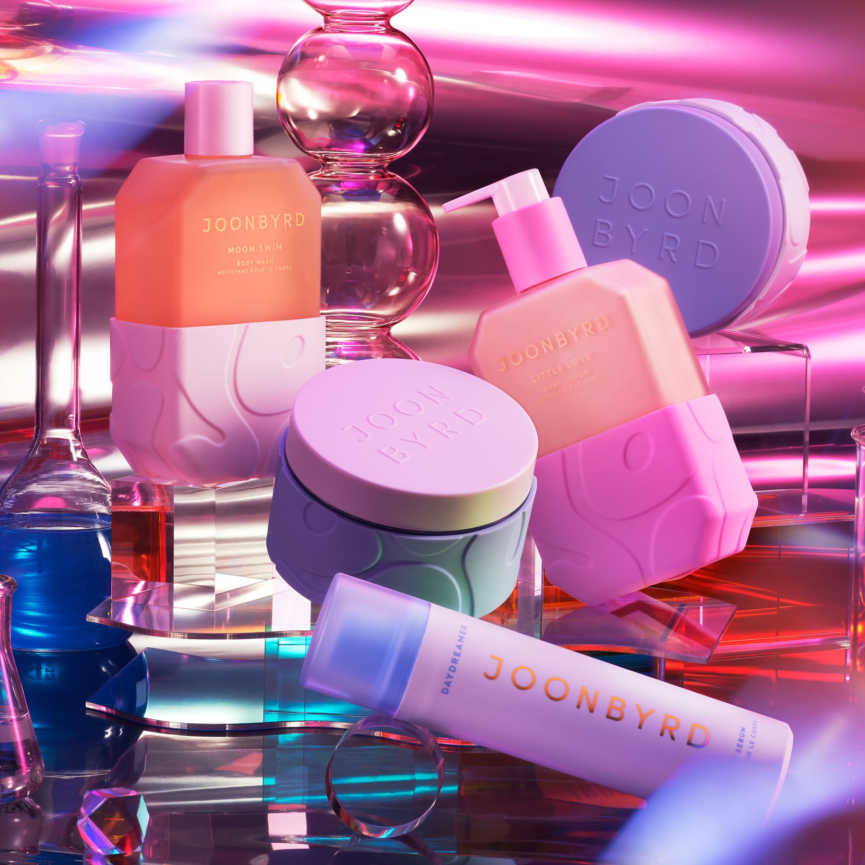
The line-up product includes: Daydreamer Body Serum, Violet Haze Body Scrub, Sunday Sofa Body Butter, Moon Swim Body Wash, and Little Love Body Lotion, along with refills, body tools and lifestyle accessories. The products intend to “deliver elevated self-care rituals and mind-body connection alongside clinically proven results.”
Playful and sensorial packaging
In terms of the packaging, Dr Granite wanted to create a range that looked dramatically different to other doctor-backed product ranges – which often tend to be housed in ‘clinical-looking’, simple, white packaging. To do so, she enlisted the help of UK packaging company, Hunter Luxury.
As head of beauty at Hunter Luxury, Pippa Bell explains, the main challenge was to capture all these different concepts via the pack. To do so, the company created a “a sweet bubblegum aesthetic that is wholly unique” and shared that the thought process was to “combine spirituality with science and modern sensibilities with a playful sense of childhood nostalgia.”
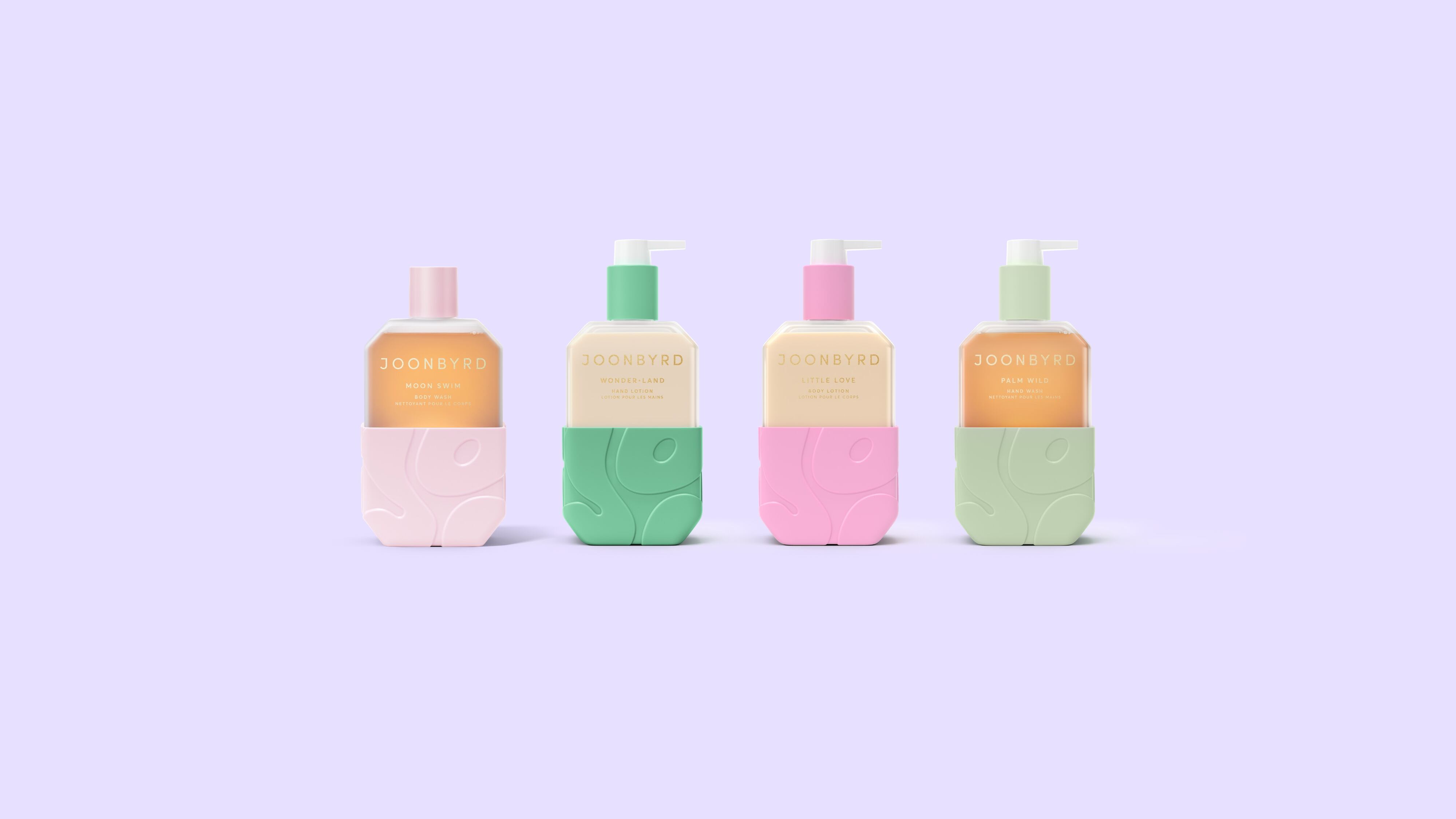
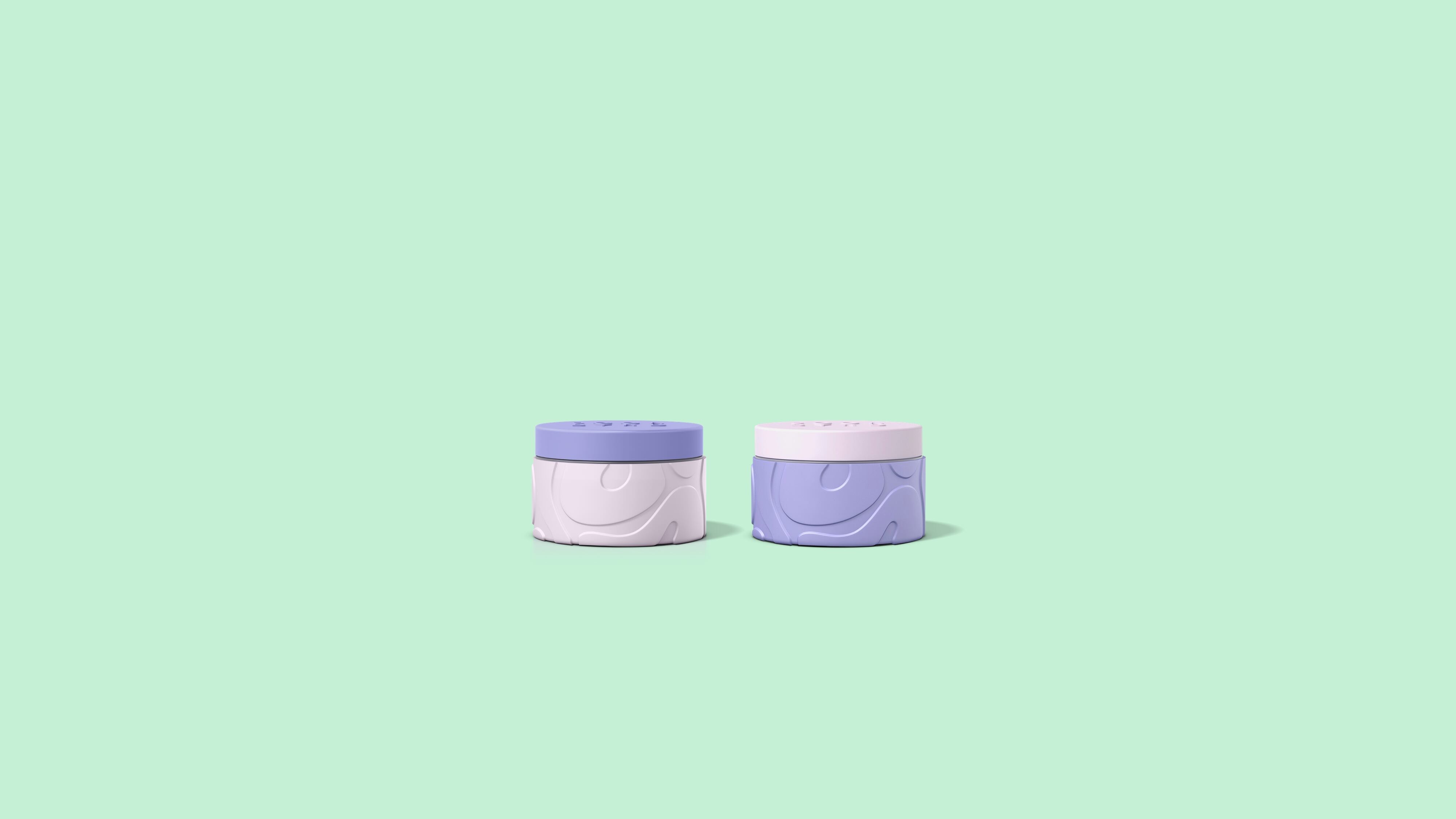
Hunter Luxury decided to create a playful look, which focuses on the sensorial aspects of body care through packaging design, product textures and fragrances. The products have contrasting textures of Joonbyrd-sourced glass and Hunter Luxury-designed soft-touch, food-safe silicone sleeves for a “tactile experience.”
Packs are coloured in bright pastel hues and embossed with patterns based around the Joonbyrd logo, while the sleeves were designed to contrast with the colours and complement the texture of the glass containers, to create a tactile product that also feels good to touch.
“Joonbyrd was drawn to silicone and glass in particular as they offered an opportunity to create a highly sensorial soft touch finish,” explained Bell.
“This is matched by the shape of the bottles, which feature soft bends and curves that offer both visual and tactile appeal.”
The silicone was embossed across its whole surface area with large Joonbyrd logos, acting as a ‘hidden’ logo while also adding a unique texture for consumers to explore,” she explained.
Overcoming design challenges
Working with silicone presented some technical challenges for Hunter Luxury’s designers.
“While the bubbly typography of the logo looks chaotic and random, achieving the combination of complex embossed curves that could be consistently recreated at scale during production required precision engineering,” according to the packaging designer.
The embossed pattern also needed to be balanced against the need for the right level of rigidity and the silicone sleeves needed to grip the containers firmly without sagging or slipping away. However, the sleeve also needed to be easily removable so it could be cleaned.
Finding the perfect balance between all of these factors required "an intensive design process in which the mould was resized and remade several times until the perfect solution was found."
As such, the final design of the sleeve is slightly tapered to give a tactile experience while also gripping the containers firmly.
“The Joonbyrd experience flies in the face of what you expect from a skin care brand,” said Bell.
“Capturing that meant really getting under the skin of our customer – and working hand-in-hand with them every step of the way, from concept to creation.”
“As this is the brand's launch, we had to go the extra mile to make a huge first impression. We aimed to perfectly crystallise what this brand is about, making it clear to consumers at first glance even if they aren’t familiar with the name Joonbyrd yet,” she explained.
“At the heart of Joonbyrd is joy, so we set out to create entirely unique and uplifting packaging that touches the senses through shape, colour and texture,” explained the brand’s founder, Dr Alexis Granite.
“We looked to a variety of industries for inspiration, from food to fragrance to fashion, for packs that would capture attention, bringing that hit of happiness on the shelf.
“Equally, we sought to work with materials that were sturdy enough to be reused and refilled many times over,” she said.
“We loved the idea of creating a brand pattern that was instantly recognisable within the silicone, embedding each product with a "hidden" logo.”
Creating an amythyst gua sha
Hunter Luxury’s partnership with Joonbyrd went further than just packaging, as it also sourced and produced a special body gua sha tool.
Each one is crafted from amethyst to “reflect the playful, sensorial curves that are core to the Joonbyrd identity.”
As each stone is carved out of amethyst, no two are exactly alike, with the purple hues in each stone ranging from pale lilac to deep violet.
The stone is also fitted with a thermochromic silicone grip, styled into Joonbyrd’s JB logo that adorns every product in the range. Its heat sensitivity enables the grip to change colour when touched, turning the logo a dusky pink when used and adding an extra layer of joyful interactivity to the product.
Each gua sha tool is packed in a silicone travel case with an EVA insert, carefully shaped to match the naturalistic curves of the tool while also featuring a small aperture to enable the user to easily prise the stone out of its pack. The insert holds the tool securely in place, ensuring it reaches the consumer in perfect condition.


