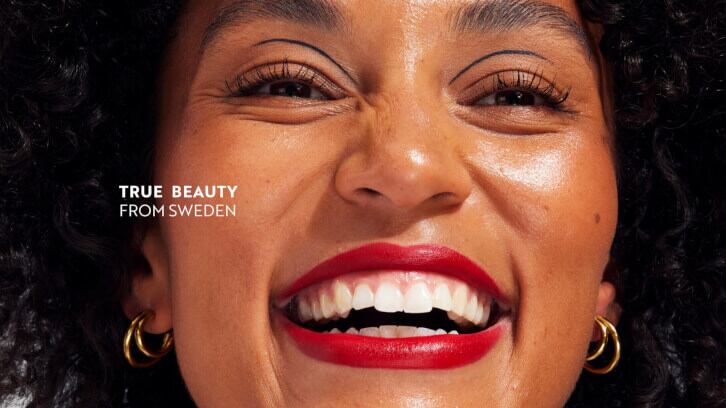
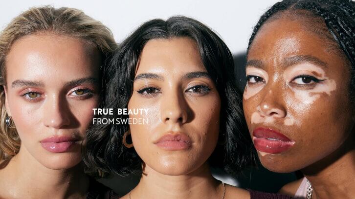
The 40-year-old makeup brand, which is present in 40 different markets across the globe, worked with Scandinavian branding agency Everland to create a new brand platform, visual identity, and pack design.
The brand is aimed at multiple demographics, rather than one specific age group or consumer cohort, and the agency began by researching the company’s history and wide-reaching customer base.
IsaDora had long been ahead of the curve compared with the general beauty industry, having put a focus on cruelty-free, ophthalmologically tested and fragrance-free products long before this mainstreamed and became a consumer demand.
Creative director and partner at Everland Carl Larsson noted that the brand “doesn’t shout its achievements from the rooftops; it’s simply superior, already having done the better thing for decades.”
Larsson said that the design agency therefore chose to “highlight this kind of noble attitude” in the new visual identity.
“IsaDora has something very few brands have: genuineness”, he continued. “We knew it was this special ingredient we had to bring out in the new brand.”
“Being Swedish means being genuine"
The brand’s CEO Rasmus Helt Olsen explained that this was part of the Scandi beauty brand’s genetic code.
“Being Swedish means being genuine added with subtle coolness. It’s honest, authentic, and empowering,” shared Olsen.
“This moral compass helps us stay true, transparent, and responsible in everything we do. Ultimately, being inclusive allows everyone to set their own beauty standards, and for us to reconnect with a younger audience in a more modern way.”
Meanwhile, IsaDora’s global marketing director Felicia Ibsen said that while the brand already had a strong reputation, it had identified a need to modernise its brand, values, purpose, and communication “to stay relevant and strengthen our purpose and mission to grow our business and improve brand position and consumer perception.”
Ibsen explained that the rebrand was aiming to “improve brand perception and equity to drive consideration and acquisition – growing the consumer base to recruit new consumers and gain market share to grow the business – all with a consumer-centric approach.”
She explained that IsaDora's team does regular consumer research studies and brand tracker online surveys to help it measure its KPIs and objectives.
As part of this tracking, it undertook a study in its ‘home market’ of Sweden before it rebranded and then another after the rebrand to measure the changes. It discovered that brand penetration was slightly higher after the rebrand – at 54.3% (up from 51%); while ‘consumer perception of value’ jumped up to 50% (from a previous 16%); and ‘general likeability’ also rose from 3.6 to 3.8.
Eclectic expression based around Scandi minimalism
Throughout the rebrand, Everland’s team put a focus on clearly emphasising IsaDora’s position in multiple markets and “telling its long and proud history.”
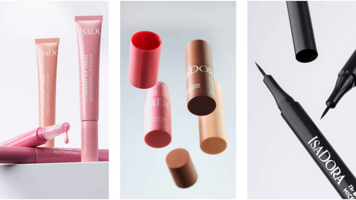
It reworked the logo to “be more elegant and balanced with stylish serifs,” which it said better reflected the brand values compared to the previous version.
The agency said it chose to work with multiple typefaces to “enable eclectic expression that is based around Scandinavian minimalism.”
It ensured that the brand’s geographical and cultural roots were still visible in the redefined image style – yet “more inclusive and timeless.”
Larsson also noted the decision to add the word ‘the’ to all product names. “A small thing, but it reflects the pride and care that IsaDora puts into every product,” he explained.
“All products are ‘hero’ products, so to speak. That is also why we gave the packaging the same colour as the product. We aren’t afraid to show the content because we’re very proud of it.”
From Ibsen’s perspective – as global marketing director – the brand now has the visual branding tools it needed to meet its future growth ambitions, which she noted “aren’t just superficial, but are deeply strategic, practical and commercial.”
“They’ll help us reconnect with a younger audience in a modern way, all while being proud of what IsaDora has achieved and continues to strive for – as we celebrate all kinds of beauty,” she concluded.
