The ranges cater to three trends in particular: 'epoque', 'verve' and 'imagine' which the brand found to be leading the way in terms of what's grabbing consumer attention when it comes to make-up products.
Project manager Dorothee de Maisonneuve spoke to Cosmetics Design about the importance of investing in technology for the company and how the ranges were developed around these trends.
3 ranges based around 3 trends
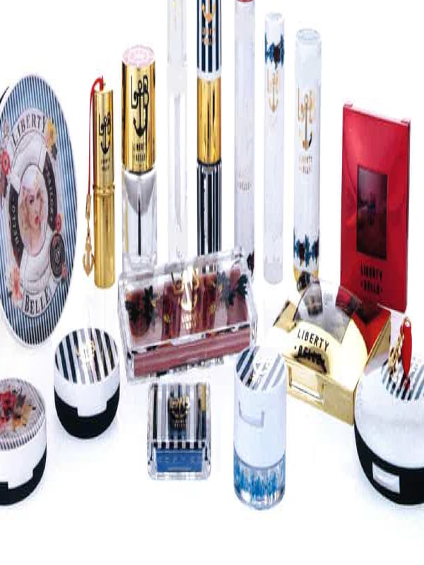
Firstly, the project manager highlights the Epoque trend, one that draws on belle epoque – a period in the early 1900s Europe characterised by optisism and prosperity. This style plays on nautical navy and whites, florals and seaside fashion and a focus on red, navy, and aqua blue colours.
"Based on the research we took these characteristics and translated them onto the packaging by incorporating a bright gold metallised finish for a vintage feel, while digitally printed artwork combines a burlesque style alongside an anchor motif and hot stamped logo."
"A contrast of finishes is then achieved by juxtapositioning a gloss UV laquer against soft touch for notably tactile effect while classic typography is used for traditional and romantic effect," she adds.
With Verve, de Maisonneuve says there is now a clear influence from Latin America on a global scale. With this she says there is a t
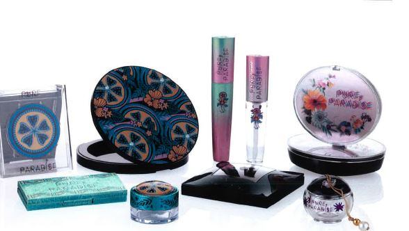
rend towards native floral and exotic rainforests accompanied by vibrant tropical colours. "This range therefore takes on a sophisticated and summery look with vivid and vibrant finishes."
"As you can see exotic fruits and tropical flowers are the main motifs and a gradient spray gives a soft colour blend effect over a silver metallisation while a crystal collision metalised effect lifts flat colour and brings a highly contemperary finish to the range," she further explains.
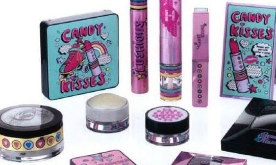
Finally, Dorethee describes the Imagine trend as being all about innovative cute finishes and typography of a doodled, bubbly or sketched style, featuring colours like bubblegum and lemon drop, humourous graphics and playful themes.
"With this range we opted for aluminium plates and geometrical print with candy coloured rainbow metallised finishes and simple motifs extracted and reworked into repeating trims."
The range includes a 'Comb end mascara', an accessory that functions as a mascara applicator complete with a slider comb that retracts to separate the lashes or brows.
And a 'rotating minerals pack', which offers consumers a clean and economical way to apply mineral and powder products. It operates by dialing the shifter and shaking to release a handy single shot of powder into the removable base, while shaking the product again will release as many measured doses as required.